")
")
")
Charts
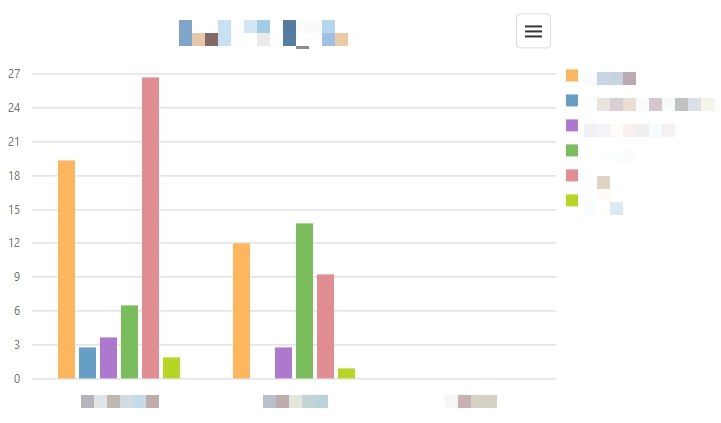
You probably want to present the results of your study at the end of the multimomentanalysis. Charts are an essential tool for visualising results and correlations. Don't worry - you don't have to create these manually. Go to Reporting > Charts. There, you can create numerous charts and save them for later usage with just a couple of clicks. The displayed chart adjusts itself to your settings automatically.
With each chart the following settings are available:
Dimension 1: Select the first dimension you wish to include in this chart.
Dimension 2: Select the second dimension you wish to include in this chart.
y-axis: Specifiy whether the values of the y-axis should be absolute or in percent.
Type: Select the chart type of your choice (i.e. bar chart, column chart, pie chart).
How to create a chart:
1. In the administration of your project, go to Reporting > Charts.
2. Adjust the available settings to your needs on the right side of your browser.
3. Click the refresh button ![]() in the upper right corner of your browser.
in the upper right corner of your browser.
How to save a chart:
1. In the administration of your project, go to Reporting > Charts.
2. Click the menu icon ![]() in the upper right corner of the chart.
in the upper right corner of the chart.
3. A menu should appear. Select the file type of your choice.
4. A pop-up window of your browser is displayed. Select Save File and click OK.
5. You will find the chart in the download folder of your computer.